
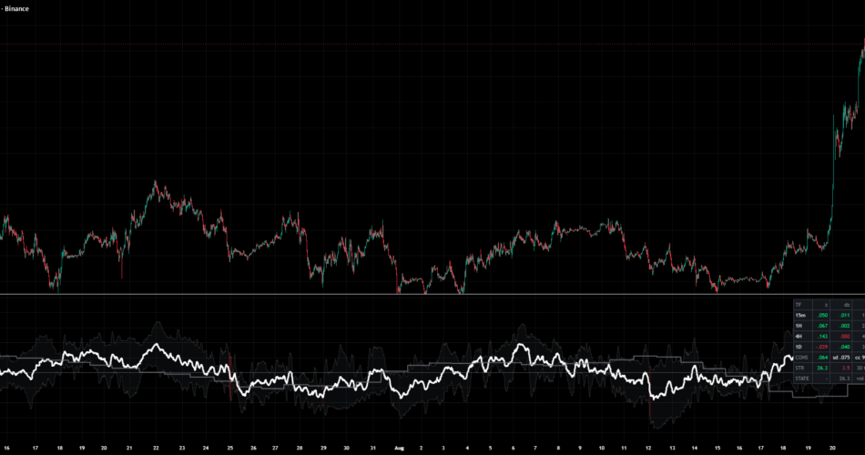
WHAT IT DOES
Inside each of four timeframes (15m, 1H, 4H, 1D by default) it builds OBV, takes the per-bar slope as the difference of two linear regressions, and standardizes that slope by the rolling standard deviation of OBV over the same timeframe. The result is a z sensor per timeframe. OBV is cumulative, so its level depends on where the chart’s history begins – the slope difference and the standard deviation are both invariant to that origin, which is what makes the four timeframes comparable at all.
The white line is the weighted mean of the four z sensors. The ribbon is the weighted dispersion around that mean, so it narrows when the timeframes agree and widens when they do not. Its colour is a geometric mean of three terms: concentration (how tight the dispersion is), side agreement (how much weight sits on one sign), and acceleration agreement (how much weight is moving further in that direction). An audit table prints every sensor’s z, its one-bar change, its weight, the consensus, the dispersion, the concentration, both strengths and the current state.
WHAT THE MEASUREMENT FOUND
Two things, both on 6,000 bars of BINANCE:BTCUSDT 15m (5,949 bars after warm-up, 2026-06-17 01:15Z to 2026-08-18 13:00Z), repeated identically on ETHUSDT.
First: the previous default threshold could never be reached. The strength is a geometric mean of three fractions, and the acceleration term keeps it small. Measured over the whole window, the strength peaks at 34.5 on BTCUSDT and 36.0 on ETHUSDT, with a median of 20.1 and a 99th percentile of 31.0. The shipped threshold was 60. So the coloured ribbon never appeared on a single bar, both alerts fired zero times, and the branch that paints the ribbon was unreachable code. That is a calibration error, not a conservative setting, and it is fixed here: the default is now 30, where the coloured state covers 137 of 5,949 bars on BTCUSDT and 173 of 5,949 on ETHUSDT – roughly one bar in forty.
Second: the whole scale is far smaller than the script’s own furniture suggested. The consensus never leaves ±0.141 and the dispersion never exceeds 0.132, while the sensor clips at ±3 and the pane drew guide lines at ±1.5. The clip has never once bound. The guides are now at ±0.10, just above the 99th percentile of |consensus| (0.114 on BTCUSDT, 0.116 on ETHUSDT), so they mark something the series actually reaches.
Neither of those is a claim about returns. There is none here: no forward-return figure, no hit rate, no edge. What the indicator offers is a picture of whether four OBV slopes are pointing the same way and how tightly, and the honest reading of the numbers above is that the picture is a low-amplitude one.
HOW THE NUMBERS WERE CHECKED
The whole computation was reimplemented outside Pine and cross-checked against this chart’s Data Window: eight quantities on ten bars, with the individual sensors switched on so nothing was left as na. All 80 values round-trip to the exact three decimals TradingView printed. The worst raw disagreement is 4.9e-4, which is the rounding floor of indicator(precision = 3) rather than a modelling error.
That check discriminates. Near-miss variants a careless port would land on fail loudly against the same 80 values: reading the higher timeframes in developing rather than confirmed mode misses 79 of 80, a slope length of 21 instead of 20 misses 73 of 80, and a flipped regression orientation is off by two orders of magnitude more than the tolerance.
SETTINGS
The HTF data mode is the one that changes the meaning rather than the tuning. Confirmed only reads the last closed bar of each requested timeframe, which is why the higher-timeframe sensors are step functions that hold their value across the chart bars inside one higher-timeframe bar. Developing HTF reacts earlier and changes until that bar closes.
The four attention weights are normalized onto a simplex, so only their ratios matter, and an all-zero entry falls back to 0.10 / 0.20 / 0.40 / 0.30.
WHAT CHANGED IN THIS VERSION
The threshold and the guide lines were recalibrated against the measured output range, as described above. The audit table that the settings already promised did not exist in the code – the helper functions for it were written and left unused – and it is now implemented. An MPL header and a leftover compile sentinel plot were added and removed respectively. No computation was changed: every plotted series is identical to the version the 80-value cross-check was run against, which is why the figures above still apply.
Open source under MPL 2.0. Nothing here is a forecast, a signal service, or a claim of profitability.
Source link
Author

- Ytv Market News
- Share-market news writer and analyst with deep experience covering equities, commodities, forex, and cryptocurrencies for readers in the USA, UK, Canada, and Australia. Ytv Market News delivers timely market updates, practical trading insights, and clear explanations of macro and company-level catalysts that move prices. Combines on-the-ground financial reporting with technical analysis, using concise charts and actionable ideas to help investors and traders make smarter decisions.
Latest entries
 UkAugust 24, 2026Nvidia Earnings, Iran Sanctions and Fed Outlook Drive Market Caution: Dow Jones, S&P, Nasdaq, Wall Street Futures
 AustraliaAugust 24, 2026Adore Beauty Group Looking for Profit Step-Up after Record FY26 Revenue
 UsaAugust 24, 2026Social Security COLA Estimate for 2027 Slips as Inflation Cools — Here’s What It Means for Your Check
 AustraliaAugust 24, 2026Why PLS, Bendigo Bank and Ampol shares are turning heads on Monday