
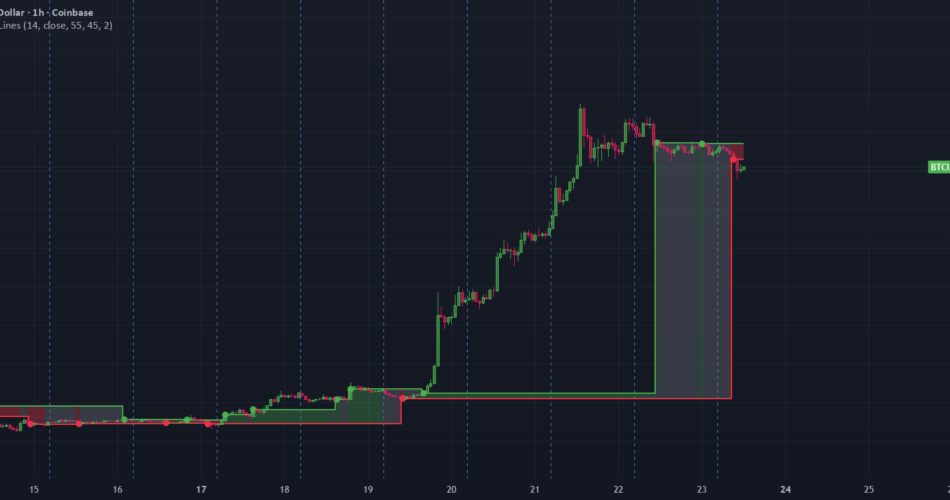
This indicator plots a dynamic price zone bounded by two independent step lines, each anchored to price at the moment RSI crosses a customizable upper or lower threshold. Rather than a single reference point, you get a full band that expands, contracts, and shifts as momentum moves between overbought and oversold territory — giving a visual read on where price sits relative to recent RSI extremes.
How the two boundary lines are built ? :
RSI (default length 9, source close, both adjustable) is checked against two thresholds — an upper threshold (default 55) and a lower threshold (default 45), both customizable in the inputs panel.
The upper level (green line) snaps to whatever price closed at the exact bar RSI crosses above the upper threshold. It then holds flat until the next upper-threshold cross.
The lower level (red line) snaps to price the moment RSI crosses below the lower threshold, and likewise holds flat until its next cross.
These two lines move completely independently of each other — the upper line only reacts to upper-threshold crosses, the lower line only to lower-threshold crosses. This means the zone width is not fixed: it can widen, narrow, or occasionally invert briefly if RSI whipsaws rapidly between both thresholds.
The zone fill :
The space between the two step lines is shaded continuously, and its color reflects RSI’s current position — not which line moved most recently:
Green — RSI currently above the upper threshold → momentum extended to the bullish side
Red — RSI currently below the lower threshold → momentum extended to the bearish side
Grey — RSI sitting in the neutral 45–55 band → no clear momentum extreme
This lets you see at a glance not just where the momentum-derived price boundaries are, but whether RSI is actively pushing an extreme right now or has settled back into neutral.
Cross markers (the dots):
A small circle prints on each bar where a threshold cross occurs — green dots for upper crosses, red dots for lower crosses — so every boundary update is easy to spot even when the step lines blend into a long flat run.
What this indicator does and does not do? :
This tool visualizes a momentum-derived price band and its current bias; it does not generate buy/sell signals, predict future price direction, or manage risk. All thresholds, RSI settings, line colors, and zone fill colors are fully adjustable in the settings panel. As with any indicator, it’s intended to be read alongside broader market structure and your own risk framework, not used in isolation.
Source link
Author

- Ytv Market News
- Share-market news writer and analyst with deep experience covering equities, commodities, forex, and cryptocurrencies for readers in the USA, UK, Canada, and Australia. Ytv Market News delivers timely market updates, practical trading insights, and clear explanations of macro and company-level catalysts that move prices. Combines on-the-ground financial reporting with technical analysis, using concise charts and actionable ideas to help investors and traders make smarter decisions.
Latest entries
 UsaAugust 24, 2026Quantum Computing Stocks IonQ, Rigetti Computing, and D-Wave Quantum Have Put Wall Street on Notice With This $863 Million Warning
 AustraliaAugust 24, 2026Up 52% from its low! Has the WiseTech share price finally bottomed out?
 Crypto NewsAugust 24, 2026Solana price risks pullback as MACD turns bearish
 Politics News TodayAugust 24, 2026Enes Kanter Freedom speaks out on WNBA ejection and more top headlines