
A Plain-English Guide
Authors Stephen_F and Claude, August 19, 2026What This Tool Shows You
Sector Rotation Lines is a chart tool that answers one simple question: “which parts of the stock market are doing better or worse than the others, right now?”
The U.S. stock market is made up of 11 broad sectors — groups of companies that do similar things. Technology, Financials, Health Care, Energy, and so on. Money doesn’t move evenly through all of them at once. At any given time, some sectors are leading (attracting more buying) and some are lagging (falling behind). Traders call the natural ebb and flow between them “sector rotation.”
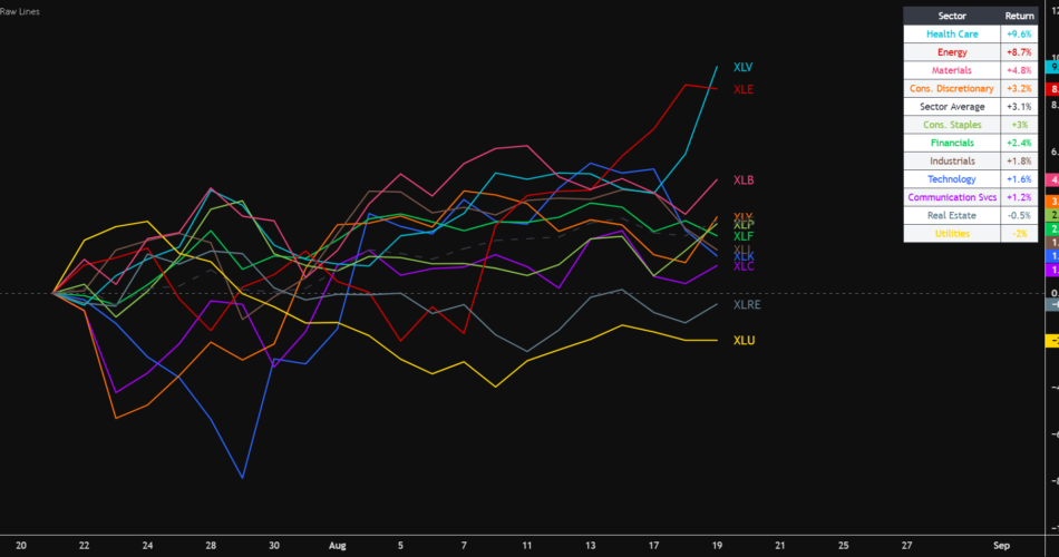
This tool draws one line per sector, all starting from the same point (zero), so you can see at a glance who’s pulling ahead and who’s falling behind over whatever time period you choose.
How to Read the Chart
• Every line starts at 0% on the left-hand side. That’s the “starting line” for all 11 sectors — they all begin equal, even though the underlying stocks are priced completely differently.
• As you move right across the chart, each line rises or falls based on how much that sector’s price has gone up or down since the starting point.
• A line sitting above 0% means that sector has gained value since the start of the window. Below 0% means it has lost value.
• The higher a line sits above the others, the stronger that sector has performed over the period you’re looking at.
Why rebase everything to zero?
A single share of one sector fund might cost $40, while another costs $200. Comparing raw prices tells you nothing useful. By resetting every sector to the same starting point, the chart lets you compare percentage moves directly — an apples-to-apples view of performance.
The Dashed Average Line
Alongside the 11 colored sector lines, you’ll see one black dashed line. This is the average of all 11 sectors combined — think of it as “the market as a whole,” built directly from the same sectors on your chart (it isn’t a separate index or fund).
This line is one of the most useful things on the chart:
• Any sector line sitting above the dashed average is currently outperforming the broad market — it’s a leader.
• Any sector line sitting below the dashed average is currently underperforming — it’s a laggard.
This is the quickest way to separate the sectors worth paying attention to from the ones that are just drifting along with everything else.
Choosing Your Data Source
Sector performance can be measured a few different ways, depending on which fund family’s products you use as the stand-in for each sector. This tool lets you pick from five built-in options, plus a fully custom option:
Option — SPDR (Cap-Weighted)
The most widely watched sector funds (the “XL” funds). Weighted so larger companies count for more — this is the industry-standard default most people mean when they talk about “the sectors.”
Option — Vanguard (Total Market)
Vanguard’s broader sector funds, covering a wider slice of each sector’s companies, not just the biggest names.
Option == Invesco (Equal-Weight)
Every company in a sector counts equally, regardless of size. This can highlight smaller companies that a cap-weighted view would hide behind giants like Apple or Microsoft.
Option — Fidelity (Total Market)
Fidelity’s version of broad sector coverage, similar in spirit to Vanguard’s.
Option == S&P 500 Sector Indices
The raw index values behind the sector funds, rather than a tradable fund itself.
Option == Custom
Type in your own preferred symbol for each sector if you have a specific fund family or ticker in mind.
If you’re not sure which to pick, the SPDR (Cap-Weighted) option is the most common starting point and matches what most financial news reports.
Choosing Your Time Window
Sector leadership changes over different time horizons — a sector can be the weakest performer this week and the strongest this year. The tool lets you choose how far back the comparison starts:
Window — 1 Week
The last 5 trading days — a short-term, fast-moving snapshot.
1 Month
The last 21 trading days — a good general-purpose view for spotting a rotation that’s building.
1 Quarter
The last 63 trading days — roughly three months, useful for medium-term trends.
1 Year
The last 252 trading days — the big-picture view of which sectors have led all year.
Custom
Pick your own exact start and end dates — useful for comparing a specific news event, earnings season, or period you care about.
A note on the Custom option
When you switch to Custom, you’ll set both a start date and an end date yourself. If you leave the end date far in the future, the chart will simply keep updating with today’s most recent data — exactly like the preset windows do. Only set a specific end date if you want to “freeze” the comparison at a particular point in the past, for example to study exactly what happened during a specific week.
The Labels and the Table
Two things help you identify each line without guessing:
• End-of-line labels: each line has its ticker symbol sitting right at its endpoint, so you can trace any line back to its name just by looking at the right edge of the chart.
• The legend table: a small table in the corner of the chart lists every sector by name along with its exact percentage return for the period, sorted from best performer to worst. This is the fastest way to get an exact number rather than eyeballing the lines.
A Few Ways to Use This in Practice
• Quick market check: glance at the 1 Month view to see which sectors are currently leading — this is often the first thing worth checking before digging into individual stocks.
• Confirming a trend: if a sector is above the dashed average line on the 1 Week, 1 Month, and 1 Quarter views, that’s a sector with real, sustained momentum, not just a one-day blip.
• Spotting a turn: watch for a sector that has been near the bottom of the pack starting to cross above the dashed average — this is often an early signal of money starting to rotate into that area.
• Comparing data sources: if you’re unsure whether a move is broad-based or driven by a few large companies, switch between the Cap-Weighted and Equal-Weight presets and see if the picture changes.
This tool is for informational and educational purposes and is not investment advice.
Source link
Author

- Ytv Market News
- Share-market news writer and analyst with deep experience covering equities, commodities, forex, and cryptocurrencies for readers in the USA, UK, Canada, and Australia. Ytv Market News delivers timely market updates, practical trading insights, and clear explanations of macro and company-level catalysts that move prices. Combines on-the-ground financial reporting with technical analysis, using concise charts and actionable ideas to help investors and traders make smarter decisions.
Latest entries
 CanadaAugust 24, 2026Cyient Unveils New Brand Positioning ‘Nothing Less’
- UkAugust 24, 2026US stock futures rebound as oil and bond-market pressures remain in focus: Dow Jones, S&P, Nasdaq, Wall Street
 AustraliaAugust 24, 2026Jade Gas Defines Production Licence Area as TTCBM Moves Towards Development
 UsaAugust 24, 2026Delek Logistics EVP Hobbs Buys 4,000 Shares for $200,000